The Google Chart library provides a convenient way of visualizing datasets using Javascript and embedding them in websites.
For our team page, we wanted to embed a dynamic orgchart that would be updated automatically using values stored in a Google Docs ‘database’. Finding online tutorials for this was a bit challenging, so here’s our implementation.
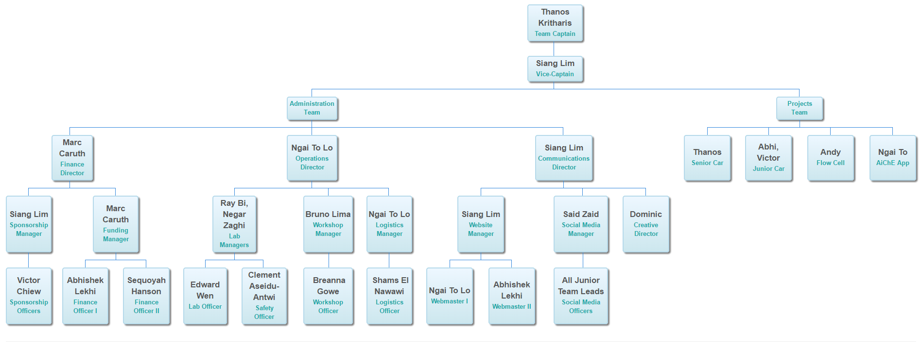
If all goes well, you should get something like this, with the names, roles and relationships defined in a Google Sheet:
We will be using the orgchart package in Google Charts. Our implementation will be somewhat similar to the example in the Google Charts documentation, but instead of hardcoding the values in JavaScript, we will grab them dynamically from a Google Sheet data source.
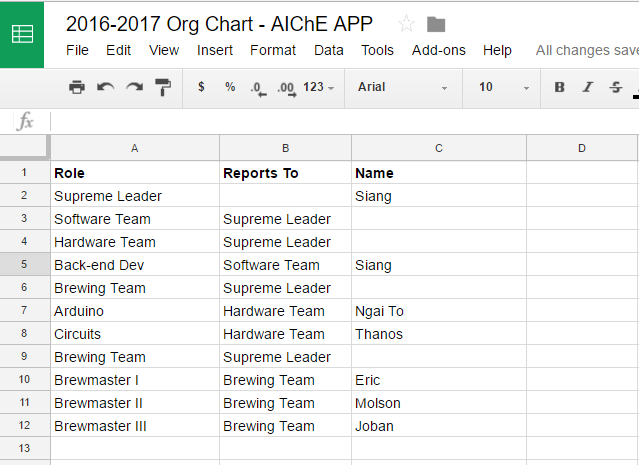
Role
Reports To
Name
Once you’re done, your Google Sheet should look something like this:
https://docs.google.com/spreadsheets/d/1qImsDykMfz-obbMsOQo6f_IW_xmNdtScByEhcnfU3S8/edit#gid=0
edit#gid=0 part to gviz/tq, as below:
https://docs.google.com/spreadsheets/d/1qImsDykMfz-obbMsOQo6f_IW_xmNdtScByEhcnfU3S8/gviz/tq
If you navigate to that link in your browser, you should get a json.txt file. You will need this link for the next step.
Once the Google Sheet ‘database’ has been set up, create a new orgchart.html (or any other name) file and paste in the following code. We will be using the Google Visualization API Query Language to help us grab data from our Google Sheet.
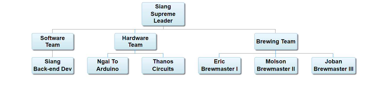
Remember to replace var dataSourceUrl with your own Google Sheet URL. Open the file in your browser, and you should see your orgchart!
<html>
<head>
</head>
<body>
  <div id="orgchart_admin"></div>
  <script src="https://ajax.googleapis.com/ajax/libs/jquery/1.9.1/jquery.min.js"></script>
  <script type="text/javascript" src="https://www.gstatic.com/charts/loader.js"></script>
  <script type="text/javascript">
    google.charts.load('current', {'packages' : ['orgchart', 'table']});
    google.charts.setOnLoadCallback(function() { initialize('') });

    function initialize() {
      document.getElementById('orgchart_admin').innerHTML = "<i class='fa fa-spinner fa-spin fa-3x fa-fw'></i>";

      var dataSourceUrl = 'https://docs.google.com/spreadsheets/d/1qImsDykMfz-obbMsOQo6f_IW_xmNdtScByEhcnfU3S8/gviz/tq?';

      // Tells it that the first row contains headers: 'Role', 'Reports To', 'Name'
      var query = new google.visualization.Query(dataSourceUrl + '&headers=1');

      // Send the query with a callback function.
      query.send(handleQueryResponse);
    }

    function handleQueryResponse(response) {
      // Called when the query response is returned.
      if (response.isError()) {
        alert('Error in query: ' + response.getMessage() + ' ' + response.getDetailedMessage());
        return;
      }

      var raw_data = response.getDataTable();
      var data = new google.visualization.DataTable();

      data.addColumn('string', 'Entity');
      data.addColumn('string', 'ParentEntity');
      data.addColumn('string', 'ToolTip');

      // Loops through all rows and populates a new DataTable with formatted values for the orgchart
      var num_rows = raw_data.getNumberOfRows();
      for (var i = 0; i < num_rows; i++) {
        var role = raw_data.getValue(i, 0);
        var reportsTo = raw_data.getValue(i,1);
        var name = raw_data.getValue(i,2) != null ? raw_data.getValue(i,2) : '';

        data.addRows([[
          { v: role,
            f: name + "<div class='role'>" + role + "</div>"
          },
          reportsTo,
          name]]);
      }

      // Loops through all rows and populates a new DataTable with formatted values for the orgchart
      var container = document.getElementById('orgchart_admin');
      var chart = new google.visualization.OrgChart(container);
      chart.draw(data, {allowHtml:true, 'size': 'large'});
    }
  </script>
</body>
</html>
initialize() function, we used the Query class to grab data from our Google Sheet. This is very similar to the example in the documentation.handleQueryResponse() callback function, if the query is successful, we can get the data as a DataTable with raw_data = response.getDataTable(). A DataTable is essentially an array of columns and rows used by Google Charts to represent chart data.raw_data and populated a new DataTable, var data = new google.visualization.DataTable(). We did this row by row with the addRows() function. We did this because the orgchart package takes in 3 columns, according to the documentation and we want to add formatted values to the first column:First Column
The first column is the node ID (each node is a box in the org chart) and as previously mentioned, it should be unique. We can either show the node ID in the box, or use a prettier formatted value, f to show in the box, but the unformatted value, v is still used as the ID. Having formatted values allows us to display the name and role (or optionally, even more data like pictures) in different colors in the same box.
In our orgchart, we want to display both the name and the role, with the role in a different color. So in the code above, we defined the formatted value as follows, with div tags around role:
f: name + "<div class='role'>" + role + "</div>"
Second Column
The second column defines the parent node of the current box (i.e. the relationship data) using the unformatted value, v of the parent node. If this is left blank, the node will be defined as a root node.
Third Column The third and optional column defines the tooltip text, the text that pops up when you hover your mouse over the box.
new google.visualization.OrgChart() to display our chart in the web page.var container = document.getElementById('orgchart_admin');
var chart = new google.visualization.OrgChart(container);
chart.draw(data, {allowHtml:true, 'size': 'large'});
So far, we’ve managed to display our org chart, but we haven’t added the formatting yet.
To change the text color for the roles in the box, we need to add some CSS. Let’s modify the head section in the code above:
<head>
  <style>
  .role{
      font-size: small;
      color: #1aa;
  }
  </style>
</head>
You should now see the font size and colors updated for the roles if you refresh your page:
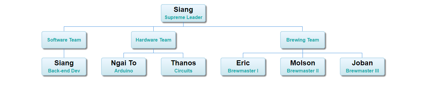
That’s it! Using CSS, you can also style the names by wrapping them with div tags. You can also play around with the box colors, font size and anything else in the org chart. Refer to the Google Charts documentation for further information.
f: "<div class='name'>" + name + "</div>" + "<div class='role'>" + role + "</div>"